The Color Shop
*
The Color Shop *

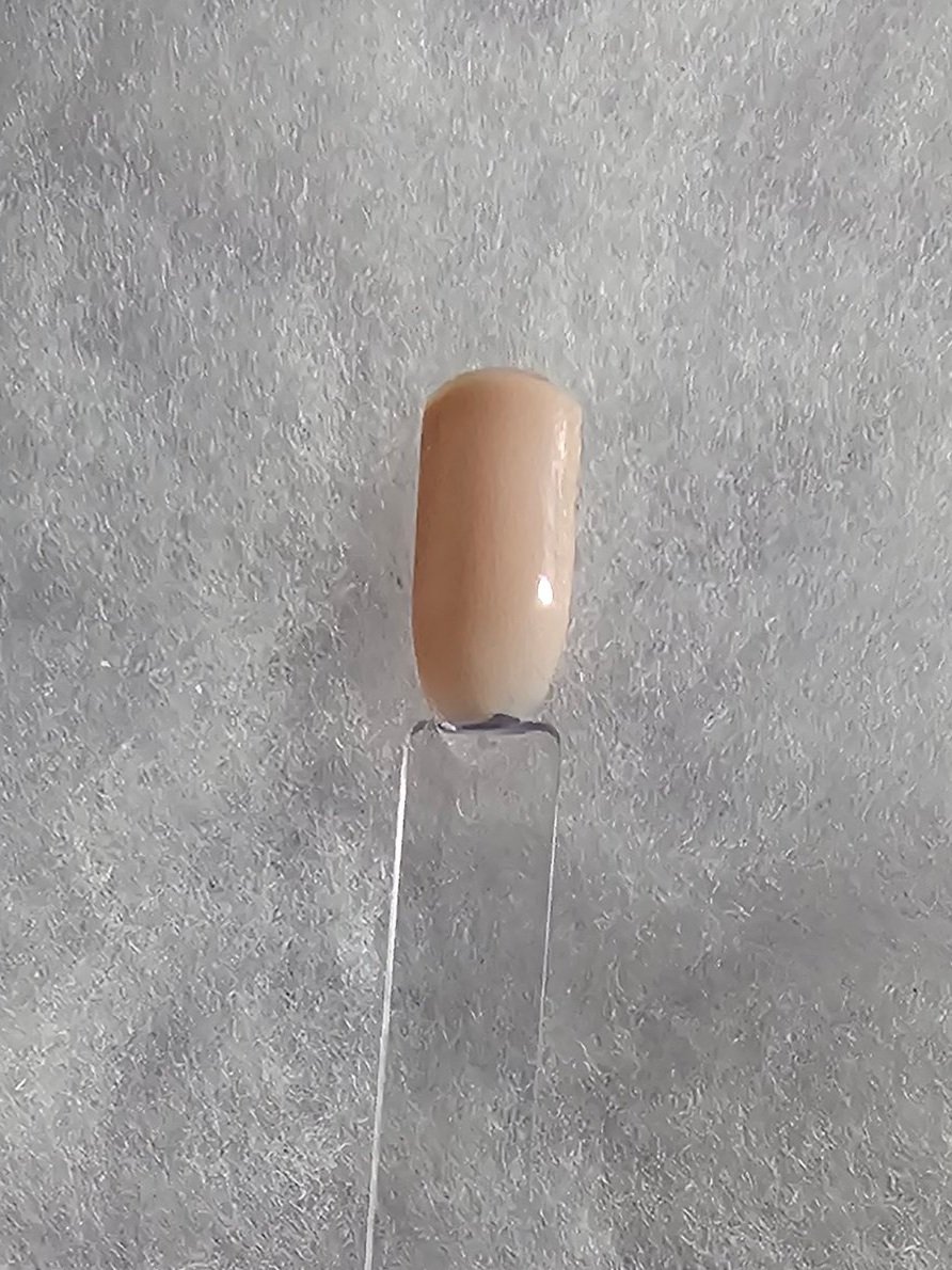
The color cream is a soft, warm, and neutral hue that lies between white and light yellow. It is a calm and elegant shade that evokes a sense of subtlety, sophistication, and refinement. Cream is often associated with comfort, purity, and timeless beauty, making it a popular choice in both design and fashion.
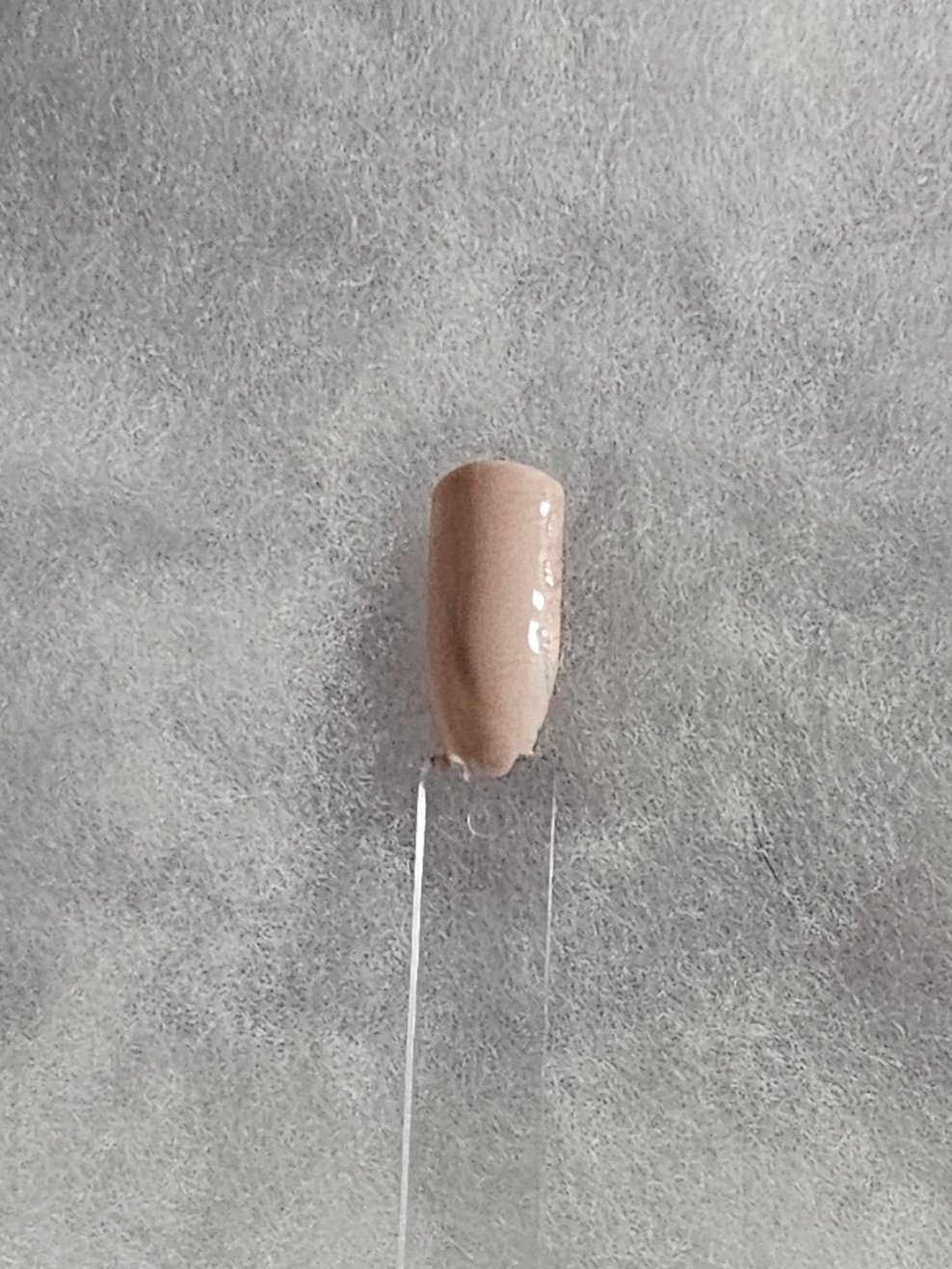
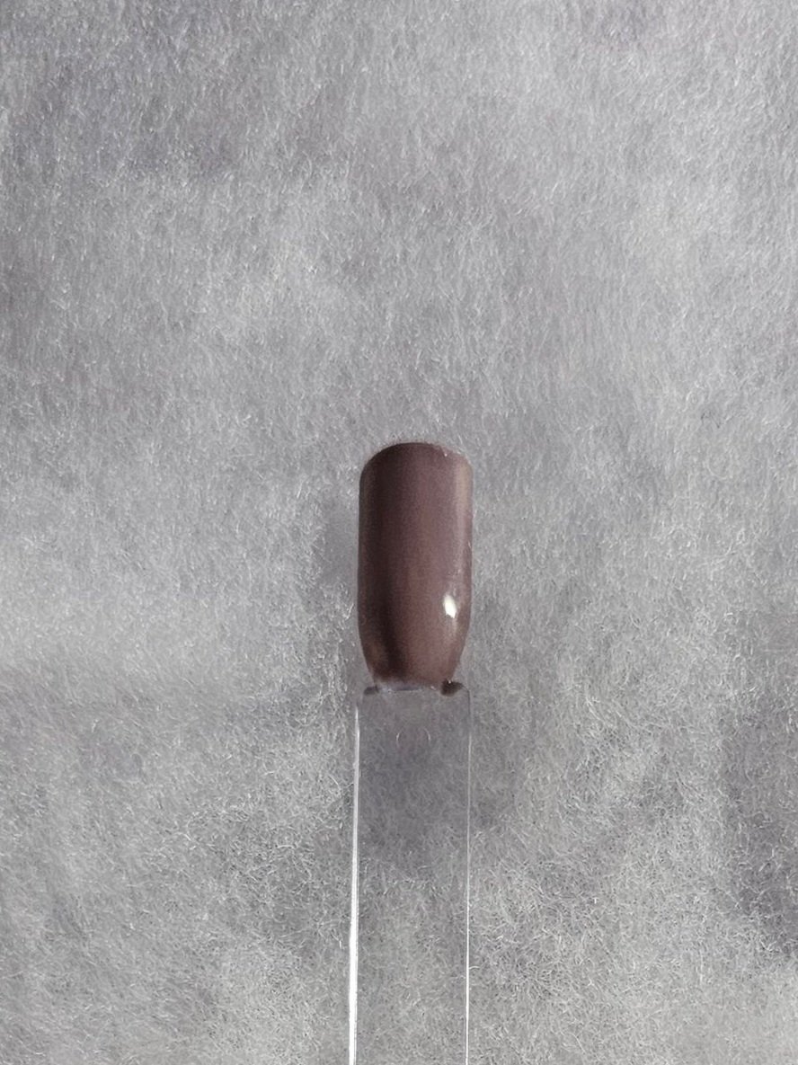
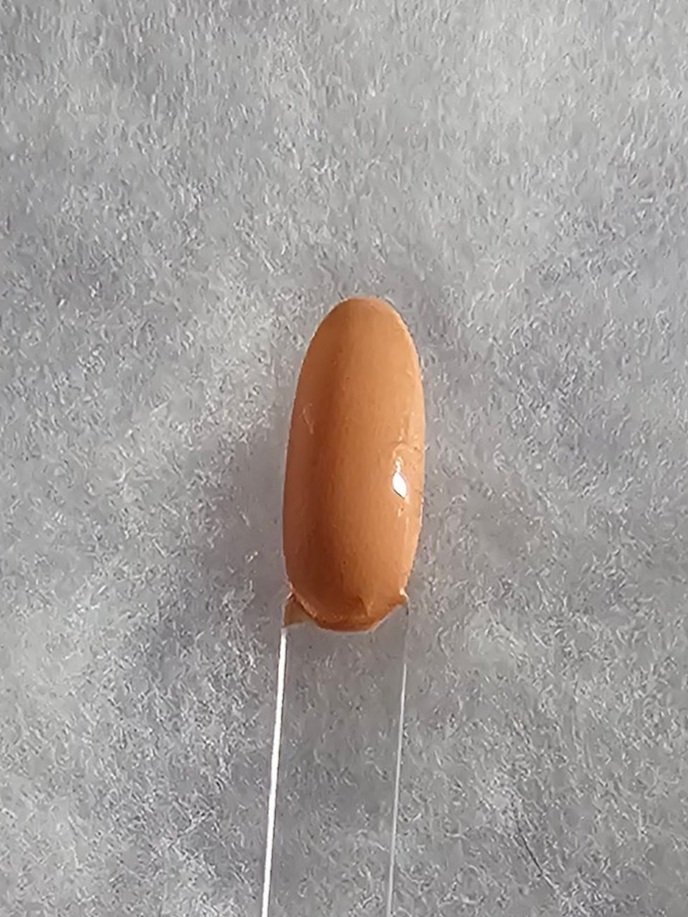
The color neutral is a range of colors that are subdued, muted, and not associated with strong hues or saturation. These colors are often used as a backdrop or complement to more vibrant colors, providing balance and harmony in design. Neutral colors are versatile and can fit various styles, from modern to rustic, and are often associated with simplicity and sophistication.
-
Hue:
Neutrals do not have a specific hue or strong color saturation, but they are often created by mixing primary and secondary colors with varying levels of white, black, or gray.
Beige: A mixture of brown and white, with yellow or gray undertones.
Gray: A mixture of black and white, which can lean cooler (blue/green) or warmer (brown/red).
White: The absence of color, a pure neutral.
Black: The absence of light, also considered a neutral.
Brown: A combination of red, yellow, and black, often appearing warm or earthy.
Ivory: A soft, warm off-white with yellow undertones.
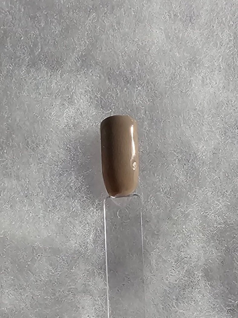
Taupe: A mix of gray and brown, often with a slight purple or pink undertone.
Cream: An off-white with hints of yellow or brown
-
Neutrals carry strong symbolic meanings and associations that contribute to their use in various settings:
Beige/Cream/Ivory: Symbolize warmth, comfort, and simplicity. They are often associated with natural elements and are seen as calming, modest, and approachable.
Gray: Represents neutrality, balance, and sophistication. It can also symbolize professionalism, formality, and maturity. Depending on the tone, gray can feel either cool (modern and sleek) or warm (cozy and grounded).
White: Associated with purity, cleanliness, and freshness. It symbolizes simplicity, innocence, and new beginnings. White is often linked to minimalism and clarity.
Black: Represents strength, authority, sophistication, and elegance. It can also symbolize mystery, luxury, or even mourning. Black is considered powerful and timeless.
Brown: Symbolizes stability, reliability, and comfort. It’s grounded, earthy, and natural, often linked to the outdoors and organic materials.
Taupe: Often associated with elegance, sophistication, and subtle luxury. It brings a refined, soft approach to modern design.
-
Neutrals have a significant psychological impact, both in terms of their calming qualities and their ability to create a sense of balance:
Soothing and Calming: Neutrals like beige, ivory, and soft gray are often used in environments designed for relaxation (such as bedrooms or spas), as they help reduce stress and anxiety by creating a serene and tranquil space.
Stability and Comfort: Colors like brown and taupe invoke feelings of comfort, warmth, and groundedness. These shades are great for creating inviting and secure environments.
Sophistication and Luxury: Deep neutrals like charcoal gray or black are linked to elegance, refinement, and exclusivity. They are often used in high-end fashion or luxurious interiors to evoke a sense of class and sophistication.
Balance and Clarity: White and gray promote clarity of thought and focus. White is often associated with a clean slate, which can help with mental clarity and organization, while gray helps to ground emotions and maintain equilibrium.
-
Neutrals are incredibly versatile and can complement nearly every color. Here are some colors that pair particularly well with various neutral shades:
With Beige or Cream:
Warm Tones: Earthy colors like terracotta, rust, mustard, or deep oranges complement warm neutrals, creating a harmonious, cozy vibe.
Cool Tones: Soft blues, sage greens, and dusty purples can add contrast while maintaining an overall balanced feel.
With Gray:
Bright, Bold Colors: Yellow, mustard, or deep red create a striking contrast against gray, adding vibrancy without overwhelming.
Muted or Cool Shades: Navy blue, charcoal, and cool greens pair beautifully with gray, maintaining a sophisticated and calming palette.
With White:
Bold Colors: White pairs well with almost any bold color—bright blues, reds, or even vibrant greens—creating a high-contrast, fresh, and clean look.
Pastels and Neutrals: Light shades of pink, mint, and soft blues provide a serene, elegant aesthetic when paired with white.
With Black:
Metallics: Gold, silver, or copper accents add luxury and drama when paired with black, enhancing its sophistication.
Bright Contrasts: Bold, vivid colors like red, yellow, and turquoise stand out when paired with black, creating a dynamic and energetic contrast.
With Brown:
Earthy Greens: Olive, sage, and deep green shades complement brown neutrals and enhance a grounded, natural atmosphere.
Warm Reds and Oranges: These hues create a harmonious, earthy feel when paired with brown, perfect for rustic or autumn-inspired designs.
-
Neutrals come in various shades, each evoking different feelings or serving different design purposes:
Warm Neutrals:
Beige, Taupe, Brown, Ivory, Cream: These shades are cozy and inviting, offering warmth and a natural feel. They are great for creating comfortable, homey environments.
Golden or Honey Neutrals: Rich, warm, and luxurious, these shades combine yellow, brown, or orange undertones for a deeper, earthy warmth.
Cool Neutrals:
Gray, Slate, Charcoal: Cool grays (those with blue or green undertones) offer a sleek, modern, and calm feel. They tend to be used in contemporary or industrial designs for their sophistication.
Cool Whites: Whites with bluish undertones create a crisp, clean, and fresh feel.
Neutral Pastels:
Soft neutrals like pale taupe, light gray, or off-white with gentle undertones of pink, lavender, or blue are soothing, elegant, and perfect for more delicate, refined spaces.
-
Hue:
Cream is a pale, off-white color with hints of yellow or beige.
It can range from a light, almost white shade to a richer, deeper beige, depending on the amount of yellow or brown present.
-
Elegance and Sophistication: Often associated with luxury and high-end design due to its understated beauty.
Purity and Simplicity: Evokes a sense of calm and cleanliness without being as stark as pure white.
Warmth and Comfort: Provides a cozy, inviting atmosphere, making it ideal for interiors.
Softness and Subtlety: Creates a delicate, gentle vibe that is easy to incorporate into various color schemes.
-
Creates a peaceful and relaxing environment, promoting a sense of tranquility.
More approachable than white, making it an excellent neutral base that doesn't overwhelm.
Conveys a sense of sophistication without being overly flashy.
-
Bold Tones: Pairs beautifully with deep, rich colors like navy, burgundy, or forest green.
Soft Tones: Harmonizes with pastel shades like blush, lavender, or powder blue for a gentle, serene palette.
Metallics: Looks sophisticated when combined with gold, silver, or rose gold accents.
-
Ivory: A slightly deeper and richer version of cream with more beige or yellow undertones.
Buttercream: A warm, yellow-tinged cream that is richer and more buttery.
Vanilla: A creamy, pale shade with a slight hint of yellow, often associated with soft sweetness.
Champagne: A light, sparkling cream with subtle pink or gold undertones, reminiscent of the beverage.


